
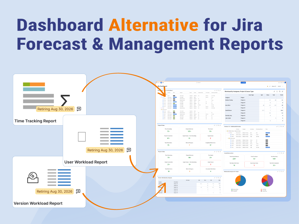
If you’ve recently opened the Reports section in Jira, you may have noticed that several familiar reports are going to be retired.
Among them are the Time Tracking Report, User Workload Report, and Version Workload Report. These reports have been part of many teams’ daily workflows for years. They helped project managers, Scrum Masters, team leads, and release managers answer simple but important questions about progress, remaining work, and team capacity.

If your team relies on these reports, it’s natural to wonder what happens next.
The good news is that while these built-in reports are going away, the information they provided is not. In fact, Jira dashboards can often give you more flexibility than the original reports. Especially when combined with configurable dashboard gadgets.
In this article, we’ll look at what each retiring report was designed to do, why teams found them useful, and how you can continue answering the same questions using Jira dashboards and Great Gadgets for Jira.
Why These Reports Mattered
At first glance, the retired reports seemed fairly simple.
There were no interactive charts or advanced analytics. Most of them displayed straightforward tables with estimates, remaining work, or workload totals.
But simplicity was exactly what made them useful.
Project managers didn’t open these reports because they wanted another spreadsheet. They opened them because they needed quick answers before making decisions.
Imagine you’re preparing tomorrow’s Sprint Planning meeting.
Before assigning new work, you need to know whether anyone on the team is already overloaded. Opening the User Workload Report immediately showed how much estimated work was assigned to each person.
Or imagine you’re reviewing an upcoming release.
The Version Workload Report quickly showed whether the remaining work was evenly distributed across the team or concentrated on one developer, potentially putting the release at risk.
Similarly, the Time Tracking Report made it easy to compare original estimates with actual logged work. If several issues had already exceeded their estimates, it could indicate that the sprint was more complex than expected or that future estimates needed adjustment.
Let’s look at each one in more detail.
What Did the Jira Time Tracking Report Actually Help You Understand?

The Time Tracking Report helped teams compare how much work was originally estimated against how much time had actually been spent.
To do that, it compared three familiar Jira fields:
- Original Estimate
- Time Spent
- Remaining Estimate
Project managers often use this report to answer questions such as:
- Are we spending more time than planned?
- Which projects are exceeding their estimates?
- How much work is still left to complete?
With this information in one place, the report provides a quick overview of project effort. However, it also had limitations. The layout was fixed, filtering options were limited, and you coudn’t easily customize how the information was grouped or presented.
What Did the Jira User Workload Report Show?
While the Time Tracking Report focused on individual issues, the User Workload Report shifted the focus to the people doing the work.
Instead of asking, “How much work remains on this issue?”, it answered a different question: “How much work is assigned to each team member?”
One limitation of the report was that you could only see the work assigned to one user at a time.

For many teams, this report became a regular part of sprint planning and resource management. Before assigning new work, managers could quickly see who was already carrying the heaviest workload and who still had available capacity.
That visibility helped teams make better planning decisions before problems appeared, rather than reacting after deadlines started slipping.
What Did the Jira Version Workload Report Show?
The Version Workload Report helped teams estimate the amount of work planned for a release or version. The report summarized the remaining work assigned to a selected version, grouped by assignee, making it easier to understand whether a release is realistically scoped.

Specifically, it answered questions such as:
- How much work remains before this version is complete?
- Which team members own that work?
- Is the workload evenly distributed?
- Does the release appear to be at risk?
This gave release managers a quick overview of both progress and ownership. Like the other reports, its biggest limitation was flexibility. It focused on one version at a time and offered limited ways to customize the data or compare multiple releases.
Why Dashboards Are a Better Long-Term Approach Than Fixed Reports
The retirement of these reports may feel like a loss at first. After all, they are familiar, easy to access, and answered common project management questions with very little setup.
But they also share one important limitation: Each report could answer only one question at a time.
If you wanted to compare estimates with logged work, you opened the Time Tracking Report.
If you wanted to review workloads, you switched to the User Workload Report.
If you wanted to prepare for a release, you opened the Version Workload Report.
Each report offered a different view of your project, but none of them gave you the complete picture. That’s where dashboards become more powerful.
Instead of opening several reports and mentally combining the information, you can build a dashboard that brings together the metrics your team reviews most often.
Build One Dashboard Instead of Three Separate Reports
Perhaps the biggest advantage of dashboard-based reporting is that you no longer need separate reports for every planning activity.
Instead of recreating each report individually, consider building a dashboard that brings all of those insights together in one place.
With a well-designed dashboard, you can monitor estimates, workloads, and release progress without switching between different reports or navigating through multiple Jira pages. Everything you need is available at a glance.
That’s one of the biggest advantages of configurable dashboards. Rather than adapting your process to fit a fixed report, you build reports that fit the way your team works.
Using Great Gadgets for Jira, you can combine several dashboard gadgets to create a complete reporting workspace that answers the same questions as the retired reports (and many more).
Create a Dashboard That Fits Your Team

One possible approach as an alternative to the Jira retiring reports (Time Tracking Report, User Workload Report and Version Workload Report) is to combine the Work Breakdown Structure (WBS) Gadget, the Pivot Table & Pivot Chart Gadget, and the Advanced Issue Filter Formula Gadget on the same dashboard.
Each gadget provides a different perspective on your Jira data, allowing you to move from a high-level overview to detailed issue information without leaving the dashboard.
Let’s see how each of these gadgets can be configured to answer the same questions (and more) as the Jira reports.
How to Recreate the Retiring Reports Using Dashboard Gadgets
One of the biggest advantages of moving from fixed reports to dashboards is flexibility.
Instead of relying on predefined reports, you can build views that answer the same questions while adapting them to your own projects, teams, and workflows.
Here are a few practical examples.
Alternative for Jira Time Tracking Report
The retired Time Tracking Report gave teams a simple way to compare Original Estimate, Time Spent, and Remaining Estimate for the issues in a project. It was useful for understanding how work was progressing and whether tasks were taking more or less effort than expected.
A similar view can be recreated using the Work Breakdown Structure (WBS) Gadget from Great Gadgets for Jira. The WBS Gadget displays your Jira issues in a structured table, allowing you to choose exactly which fields you want to include. By adding the Original Estimate, Time Spent, and Remaining Estimate fields, you can build a table that provides the same core information as the retiring report.

The real advantage is flexibility. Unlike the built-in report, the WBS Gadget isn’t limited to a fixed set of columns. You can add almost any Jira field or custom field to the table, creating a report that matches the way your team works.
For example, you might also include: assignee, project, priority, and more.

This additional context makes it much easier to analyze your projects. Instead of seeing only how much time has been spent on an issue, you can immediately identify who is responsible for it, which release it belongs to, which sprint it’s part of, or which project requires the most remaining effort.
Because the WBS Gadget is fully configurable, you can tailor the report to different audiences. Scrum Masters might focus on sprint and assignee information, while release managers may prefer to include Fix Version and Priority. Project managers can even create different views for different teams.
The WBS Gadget allows you to build a richer report than the Jira Time Tracking Report, that provides more insights in a single place.
Alternative for Jira User Workload Report
The User Workload Report helped teams understand how much remaining work was assigned to a specific team member. It was a useful report for capacity planning, but it had one important limitation: you could only view one user at a time.
When you’re planning a sprint or reviewing your team’s workload, it’s often more useful to compare everyone’s workload side by side. That’s exactly what the Pivot Table & Pivot Chart Gadget from Great Gadgets for Jira makes possible.
To build a similar report, simply configure the pivot table with Assignee and Remaining Estimate fields. Group the data by Assignee and choose the Sum calculation for the Remaining Estimate field. The result is a clear overview of the remaining estimated work for every team member in a single table.

This makes it much easier to identify workload imbalances before assigning new work. Instead of opening the report multiple times for different users, you can immediately see who has available capacity and who may already be overloaded.
The flexibility of the Pivot Table doesn’t stop there. Unlike the Jira User Workload report, you’re not limited to viewing only the total workload for each user. You can add additional Jira fields to break down the information in ways that are meaningful for your team.
For example, you can split each user’s workload by: project, issue type, sprint, fix version, priority, etc.

This additional level of detail helps managers make better planning decisions without creating multiple reports. Because the Pivot Table is fully configurable, the same gadget can support different planning scenarios simply by changing the grouping or adding new fields.
If you prefer a more visual overview, the same pivot data can also be displayed as a variety of charts, including bar charts, stacked bar charts, pie charts, line charts, and area charts. This makes it easy to tailor the dashboard to different audiences. A Scrum Master may prefer a detailed table during sprint planning, while a team lead or executive might quickly understand the workload distribution from a chart.

Rather than recreating the User Workload Report exactly as it was, the Pivot Table & Pivot Chart Gadget provides a more complete view of your team’s capacity while adapting to the way your organization manages work.
Alternative for Jira Version Workload Report
The Version Workload Report helped teams understand how much work remained for an upcoming release and how that work was distributed across team members. It was particularly useful before a release because it highlighted who owned the remaining tasks and whether the workload was balanced across the team.
However, the built-in Jira report had one important limitation as well: you could only analyze one version at a time. If you want to compare workloads across multiple releases, you need to switch between reports manually, making it difficult to get a broader view of your release pipeline.
You can recreate an extend this reporting scenario using the Pivot Table & Pivot Chart Gadget from Great Gadgets for Jira.
Start by creating a Jira filter, or simply enter a JQL query that returns the issues you want to analyze. This can include a single version or multiple versions, depending on your reporting needs. Then configure the Pivot Table to display Assignee, Fix Version, Issue Type, and Remaining Estimate. Group the data by Assignee and Fix Version, and choose the Sum calculation for the Remaining Estimate field.
The resulting table provides an immediate overview of the remaining workload for every team member working on each version.

With this view, you can instantly see not only who has the highest workload, but also which releases require the most effort. This is particularly useful if your team is developing multiple versions in parallel or planning several upcoming releases.
Unlike the Jira Version Workload report, you’re not limited to a single version or a fixed layout. You can add or remove fields such as Project, Priority, Component, Epic, Sprint, or any custom field used by your organization. This flexibility allows you to create release dashboards that match your own planning process instead of adapting your process to fit a predefined report.
Need to Review Individual Issues?
Sometimes a high-level workload summary isn’t enough. You also need to understand which issues make up those estimates.
One option is to use the Great Gadgets Controller to filter the Pivot Table further using a JQL query that returns the issues assigned to a specific team member. This provides a detailed breakdown of that person’s remaining work while keeping the same reporting approach.
All you need to do is configure the Pivot Table with a filter that returns all the work items in your project/projects assigned to all the team members, and then use the Controller to filter the data by a specific user.

Another option is to use the Work Breakdown Structure (WBS) Gadget and Great Gadgets Controller in the same way.
Configure the WBS gadget with a filter or JQL that returns all the work items and choose to display fields such as Assignee, Issue Type, Remaining Estimate and Status to create a detailed, issue-level view of the release. Because the WBS Gadget is also fully configurable, you can include the Fix Version field and display issues from multiple versions in a single report if you need. And you can also see all the dependencies and linked items, something the retiring Jira Version Workload Report couldn’t do.

Together, the Pivot Table & Pivot Chart Gadget, the WBS Gadget and the Great Gadgets Controller provide both perspectives: a high-level summary of workloads across one or multiple releases, and a detailed view of the individual issues behind those numbers. Rather than simply replacing the Version Workload Report, they give teams greater flexibility and visibility when planning and monitoring releases.
Complete Your Dashboard with the Advanced Issue Filter Formula Gadget
The Advanced Issue Filter Formula Gadget works best when combined with the other dashboard gadgets discussed in this article.
The retired Jira reports focused on displaying lists of issues and workload information. While those reports were useful, they didn’t provide a quick summary of the most important metrics for your project.
The Advanced Issue Filter Formula Gadget complements the WBS Gadget and the Pivot Table & Pivot Chart Gadget by letting you calculate and display custom KPIs directly on your dashboard. Instead of searching through tables, you can place the numbers that matter most at the top of the page, giving everyone an instant overview of the project’s current state.
Build Custom KPI in a Few Steps
Creating a custom KPI is straightforward.
Start by adding the Advanced Issue Filter Formula Gadget to your Jira dashboard and choose the same project/projects, saved filters, or custom JQLs you’re using for your other dashboard gadgets. This ensures that all the gadgets display information from the same set of issues.
Next, define the metric you want to calculate using one of the gadget’s built-in formulas.
For example, you can create tiles that display information like this:

These KPIs provide an instant summary of your project without requiring users to scan through detailed reports.
Go Beyond the Built-In Jira Reports
One of the biggest advantages of the Advanced Issue Filter Formula Gadget is its flexibility.
You’re not limited to the metrics provided by Jira’s retired reports. Instead, you can build calculations that reflect the way your team measures progress.
For example, you might create KPIs that show:
- Remaining Estimate for the current release.
- Remaining work for high-priority issues only.
- Total Remaining Estimate by project.
- Average workload across the team.
- Percentage of completed work compared to the original estimate.

As your reporting needs evolve, you can simply update the formulas or change the underlying Jira filter. There’s no need to create a new report each time you want to answer a different question.
Final Thoughts
The retirement of the Time Tracking Report, User Workload Report, and Version Workload Report marks the end of three familiar Jira reports. But it doesn’t mean you have to lose the visibility they provided.
The questions these reports helped answer are still just as important. Teams still need to understand how much work remains, whether estimates are accurate, how workloads are distributed, and if upcoming releases are on track. The difference is that, going forward, dashboards offer a more flexible way to access that information.
Rather than recreating each report exactly as it was, this is a good opportunity to rethink your reporting strategy. A well-designed dashboard can bring together issue-level details, workload summaries, release insights, and key project metrics in one place, giving your team a more complete picture without switching between multiple reports.
Using Great Gadgets for Jira, you can build dashboards that combine the Work Breakdown Structure (WBS) Gadget, Pivot Table & Pivot Chart Gadget, and Advanced Issue Filter Formula Gadget to recreate the reporting scenarios covered by the retiring reports, and extend them with additional fields, custom calculations, and visualizations that better match the way your team works.
If you’d like to see how these gadgets work in practice, you can explore Great Gadgets for Jira with a free trial on the Atlassian Marketplace.
Start building reports tailored to your own projects and workflows.
Leave a Reply